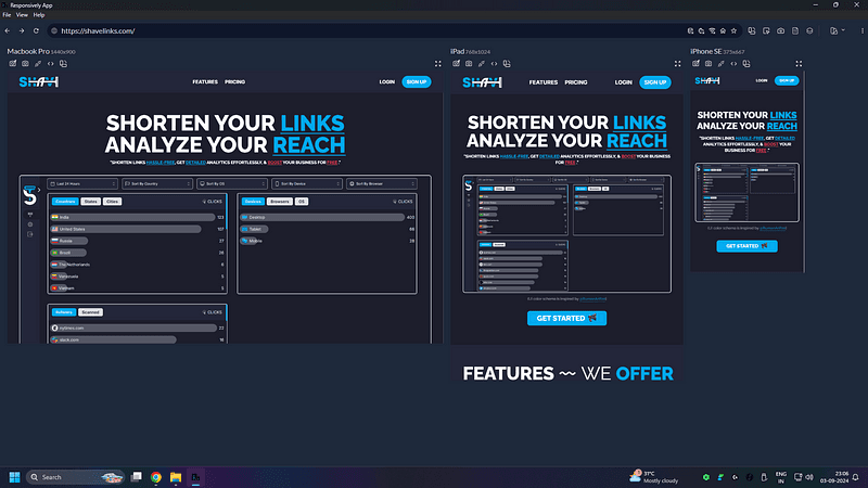
Tired of Using Inspect Element to Check Device Responsiveness?

Before we dive in, why not take a quick peek at my portfolio: https://priyalraj.com, & while you’re at it, check out my SaaS venture: https://shavelinks.com, it’s where innovation meets simplicity.
If you’re a web developer, you definitely know how important it is for your website to look good on all devices. But constantly switching between different devices or resizing your browser can be a hassle. Most developers prefer using Inspect Element, but even that can get tedious. That’s where Responsively App comes in it makes checking your website’s responsiveness super easy.
You can download the Responsively App from here.
Steps to Use Responsively App:
- Open the app.
- Paste the link to the website you want to explorer into the address bar.
- Press enter.
Note: You can even test websites running on your local host servers, which is great when you’re still developing.
See It in Action
Once you load your website, Responsively App shows you how it looks on different screens at the same time. This way, you can spot any problems right away and fix them quickly.

Final Thoughts
Remove the hassle from your life and start using Responsively App today.
Want to learn more? Watch this video to explore all the features of this app.
If you enjoyed this article, please make sure to Like, Comment and follow me on Twitter.